Marketing case study (2) - It's all in the colour?

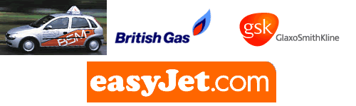
Until recently orange was the advertising world's least favourite colour. For them their research suggested that it was a colour associated with looking cheap. Yet now a wide assortment of businesses has adopted orange as their corporate colour. The merger of Smith Kline and Wellcome saw the rather bright shade of tangerine appear as the colour of the new company. Their research found that people 'feel better and inclined to think of a long and healthy life' - just what the company was aiming to do with its product range. So, why has orange made such a strong re-appearance? Well, it seems that we think of the colour as representing:
- Hope
- Fun
- Freedom
- Friendly things
- Extroverts
- Modern
- Powerful
We are all familiar with easyJet and it love affair with all things orange. They say it represents being 'up for it and passionate and sharp! Even those who have not gone over to orange for everything they have added just a touch - signal that they 'want to be liked' - look at Renault and Intel.
So, why does a colour signify so much? It seems to be part science and part art. Experts suggest that red excites, whilst blue calms us. Pink seems to mean that we eat less and of course orange, would you believe it stimulates our desire to eat. We seem to moving away from primary colours and turning our attention to the secondary. Again if one asks the experts they report that they allow breaking away from tradition and showing our desire for freedom.
If we leave colour alone for just a minute and think about how we shop then some things might become a little clearer. In the US, they believe that we make our minds up about what we like in less than 90 seconds. Once in a shopping environment (and that is a question on its own) we buy between 60 and 90 percent of our purchases on colour stimulus. This might explain why Cadbury's fight to keep purple their own. These 'visual triggers' are a vital part of our buying processes and manufacturers know this.
Another interesting fact about colour is that it means different things in different countries. The Japanese consider that red shows luxury, whereas Italians hate it as it brings bad luck. Red to Chinese people is a good luck colour, yet in many other countries it is a symbol of passion, competition and normally pitched at male products. The well-known coke can is red, as are many consumer goods, as this helps recognition. Colours change over a period of time and a visit to the Coke head office would allow us to note who the red has altered since its big introduction back in the days of the First World War. Blue, they other big primary colour also crosses cultures. It seems to symbolise cool, calm, authoritative and is seen as 'safe' - hence many banks and financial institutions choose it.
It is therefore very important to consider colour when designing logos and corporate colour schemes. Think just where we be without those 'golden arches and their close cousin the red packaging?'
Let's conclude by analysing the most popular colours.
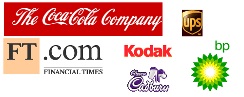
- Red = Coke. Red means power and in the Far East good luck - hence the number of companies based there who use red in their logo - Canon, Sharp and HSBC.
- Pink = FT. This makes us think innocence, which might not be the obvious shade for business. But then salmon pink is a popular corporate colour. The FT has used pink since 1893 and so it's easily recognised - in the late nineteenth century it was the cheapest colour!
- Yellow = Kodak. This is a young and dynamic colour. Kodak first used it in 1906 but now interlace red into their main logo. Their logo is one of the best recognised around the globe.
- Green = BP. Green says money, nature and luck (at least in some cultures). It is now very political and attempts to convey a strong environmental stance. The new BP logo, launched in 2000 contains some yellow as well and was put past a 'feng shui' expert before final release.
- Brown = UPS. This colour suggests solidity and a clean, straightforward approach. UPS have thought about a change but have always returned to their trusted brown. It maybe that we like memories of parcels, which is why the US market always likes the brown!
- Purple = Cadbury's. Since Roman times this colour has been associated with leadership. It still features in official government publications. It's not that popular at present as some feel it's retro and rather 70's. However, it is tipped for a return - soon.
- Blue = IBM. Blue is said to be the world's favourite colour and suggests calmness and authority. Just look at the list of names that use it - Hewlett-Packard, AT&T, Ford, P&G, Gillette, General Motors, Pepsi, Wal-Mart and Unilever. They all have their own shades but it's still blue.
Have a think about the questions below and try to answer them. Once you have had a go, follow the link below the question to compare your answer with ours.

Question 1
Explain why colour is such a powerful element of the 4P's of the marketing mix.
Question 1 - answer
Question 2
Identify methods used to incorporate colour in a firm's marketing mix.